Lately, we've had a number of threads here on topics that suggest (to me, anyhow) discriminiation on the basis of race and gender. I think it's worth reminding everyone of a bit of relevant math. Don't worry - it's all graphs and curves; no complex equations or anything like that.
Hypothetical situation. Let's say we have two groups: Group A and Group B. Both groups have different aggregate characteristics; some of these characteristics can be plotted as a curve like this one:

Don't worry about the title or the units; it's just a handy graph I found through a quick Google search that had the right shape. For our hypothetical example, let's assume that the blue line describes Group A and the red line describes Group B, and let's make the X axis... oh, say height in feet.
So, the average height for Group A is 4 feet, but most members aren't 4 feet. Most are either shorter or taller. Similarly, the average height for Group B is 6 feet, but most members of the group are either shorter or taller than this average.
Now... a question: would it be reasonable to say that any particular A is shorter than any particular B? No, it's not, and the reason why is the purple zone of the graph.
It's not reasonable to expect that the height of the member of a group is going to equal the average for their group. In fact, this assumption is false most of the time. Any individual member of the group is going to inhabit some point along the group's curve, but you can't know which point until you find out more information about that specific individual.
That purple zone is the overlap between the two curves. This is the region where individual members of Group A are taller than members of Group B, even though, on average, Group B is taller than Group A. And even though the average heights of the two groups are fairly widely separated, that purple zone is still quite large.
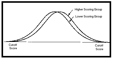
And this is for a hypothetical curve that doesn't mean anything. In my experience, the graphs that describe differences between groups of human beings more often look like this:
So... to sum up: even if your statistics are valid and your averages are based on real data (which is a pretty big "if" in a lot of these cases of prejudice, IMO), it's flat-out stupid to draw inferences about individual people based on the average characteristics of the groups to which they belong, because the individual is not the average of their group.
If you want to make rational, valid judgements based on the height, or intelligence, or anything else about a person, you need to know more than just what group the person belongs to. In most cases, you have to actually measure or talk to the person yourself.
So there you go - that's what I had to get out. Thanks for indulging me in my rant.")
Hypothetical situation. Let's say we have two groups: Group A and Group B. Both groups have different aggregate characteristics; some of these characteristics can be plotted as a curve like this one:
Don't worry about the title or the units; it's just a handy graph I found through a quick Google search that had the right shape. For our hypothetical example, let's assume that the blue line describes Group A and the red line describes Group B, and let's make the X axis... oh, say height in feet.
So, the average height for Group A is 4 feet, but most members aren't 4 feet. Most are either shorter or taller. Similarly, the average height for Group B is 6 feet, but most members of the group are either shorter or taller than this average.
Now... a question: would it be reasonable to say that any particular A is shorter than any particular B? No, it's not, and the reason why is the purple zone of the graph.
It's not reasonable to expect that the height of the member of a group is going to equal the average for their group. In fact, this assumption is false most of the time. Any individual member of the group is going to inhabit some point along the group's curve, but you can't know which point until you find out more information about that specific individual.
That purple zone is the overlap between the two curves. This is the region where individual members of Group A are taller than members of Group B, even though, on average, Group B is taller than Group A. And even though the average heights of the two groups are fairly widely separated, that purple zone is still quite large.
And this is for a hypothetical curve that doesn't mean anything. In my experience, the graphs that describe differences between groups of human beings more often look like this:
So... to sum up: even if your statistics are valid and your averages are based on real data (which is a pretty big "if" in a lot of these cases of prejudice, IMO), it's flat-out stupid to draw inferences about individual people based on the average characteristics of the groups to which they belong, because the individual is not the average of their group.
If you want to make rational, valid judgements based on the height, or intelligence, or anything else about a person, you need to know more than just what group the person belongs to. In most cases, you have to actually measure or talk to the person yourself.
So there you go - that's what I had to get out. Thanks for indulging me in my rant.
 :group::clap2::takeabow: