Mr Spinkles
Mr
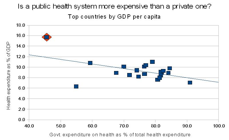
Let's try to look objectively at the data. I believe the following graph should help us answer this question. I made it using data from a World Health Organization 2010 report. The x-axis is government expenditure on health as a percentage of total health expenditure. The y-axis is total health expenditure, as a percentage of GDP. Keep in mind that 1% of GDP is an enormous amount of money. To give you an idea, the U.S. military budget is around 4% of GDP. So a few points up and down on this graph is extremely significant.
The countries shown are from the top 27 countries by GDP per capita, as of 2011. The data point representing the U.S. is highlighted by an orange diamond. The line is a linear fit to the data. Not shown are those outliers which spend less than 4% GDP on health in total: Singapore, and the Islamic/Arabic monarchies Qatar, Brunei, United Arab Emirates, and Kuwait. Also not shown are countries which receive external resources for health: Israel.
List of countries shown: Luxembourg, Norway, United States, Switzerland, Netherlands, Australia, Austria, Canada, Ireland, Sweden, Iceland, Denmark, Belgium, Germany, United Kingdom, Finland, France, Japan, Republic of Korea, Spain, Italy.
Please discuss.
The countries shown are from the top 27 countries by GDP per capita, as of 2011. The data point representing the U.S. is highlighted by an orange diamond. The line is a linear fit to the data. Not shown are those outliers which spend less than 4% GDP on health in total: Singapore, and the Islamic/Arabic monarchies Qatar, Brunei, United Arab Emirates, and Kuwait. Also not shown are countries which receive external resources for health: Israel.
List of countries shown: Luxembourg, Norway, United States, Switzerland, Netherlands, Australia, Austria, Canada, Ireland, Sweden, Iceland, Denmark, Belgium, Germany, United Kingdom, Finland, France, Japan, Republic of Korea, Spain, Italy.
Hypothesis: Public health systems are expensive, and therefore, the U.S. cannot afford such a system.
Prediction: The above hypothesis predicts that the data in the graph below should be positively correlated, not negatively correlated.
Results:
Prediction: The above hypothesis predicts that the data in the graph below should be positively correlated, not negatively correlated.
Results:
Conclusion: The best available evidence does not support the hypothesis. In fact, it supports the opposite.
Please discuss.
Last edited:
")